Colors are more than just visual elements—they have the power to evoke emotions, set the tone, and transform how we feel in a space. Let’s dive into the fascinating world of color psychology and how you can use it to design spaces that inspire, energize, or soothe.
1. Red: The Firestarter
- What It Feels Like: Passion, energy, and a spark of excitement.
- Where It Works: Dining rooms (to spark appetite), gyms (for motivation), and social hubs.
- Use Wisely: Too much red can ignite aggression—stick to accents for a bold touch.
2. Blue: The Calm Creator
- What It Feels Like: Peaceful, focused, and serene—like a breath of fresh air.
- Where It Works: Bedrooms (sweet dreams guaranteed), offices (for laser focus), and bathrooms (spa vibes).
- Stay Balanced: Overuse can feel chilly—pair with warm tones for a cozy effect.
3. Yellow: The Sunshine Booster
- What It Feels Like: Pure joy, creativity, and optimism bottled into a color.
- Where It Works: Kitchens (morning coffee with a smile), playrooms (let the fun begin), and creative spaces.
- Don’t Overdo It: Bright yellow can overwhelm—opt for softer shades for a mellow glow.
4. Green: The Nature Whisperer
- What It Feels Like: Balanced, refreshing, and full of life, like a forest after the rain.
- Where It Works: Living rooms (bring in harmony), offices (stay grounded), and yoga spaces.
- Avoid the Overgrow: Too much green can get monotonous—add textures or pops of other colors.
5. Orange: The Energy Shot
- What It Feels Like: Enthusiasm, warmth, and a zest for life in every corner.
- Where It Works: Gyms (boost your workout), dining areas (cheerful meals), and creative zones.
- Keep It Subtle: Bold orange can overpower—use sparingly or as accents.
6. Purple: The Dreamer’s Delight
- What It Feels Like: Luxurious, imaginative, and a little mysterious.
- Where It Works: Bedrooms (indulgent rest), reading nooks (fuel the imagination), and artistic corners.
- Dial It Back: Deep purples can feel heavy—lighter lavender tones are softer and more inviting.
7. White: The Canvas of Clarity
- What It Feels Like: Clean, open, and a fresh start.
- Where It Works: Kitchens (pure and polished), bathrooms (serene and spotless), and modern interiors.
- Add Depth: Too much white can feel sterile—introduce textures and colorful accents.
8. Black: The Sophisticate
- What It Feels Like: Power, elegance, and timeless sophistication.
- Where It Works: Accent walls (drama queen), furniture (sleek and stylish), and modern designs.
- Lighten It Up: Pair with lighter colors to avoid a gloomy vibe.
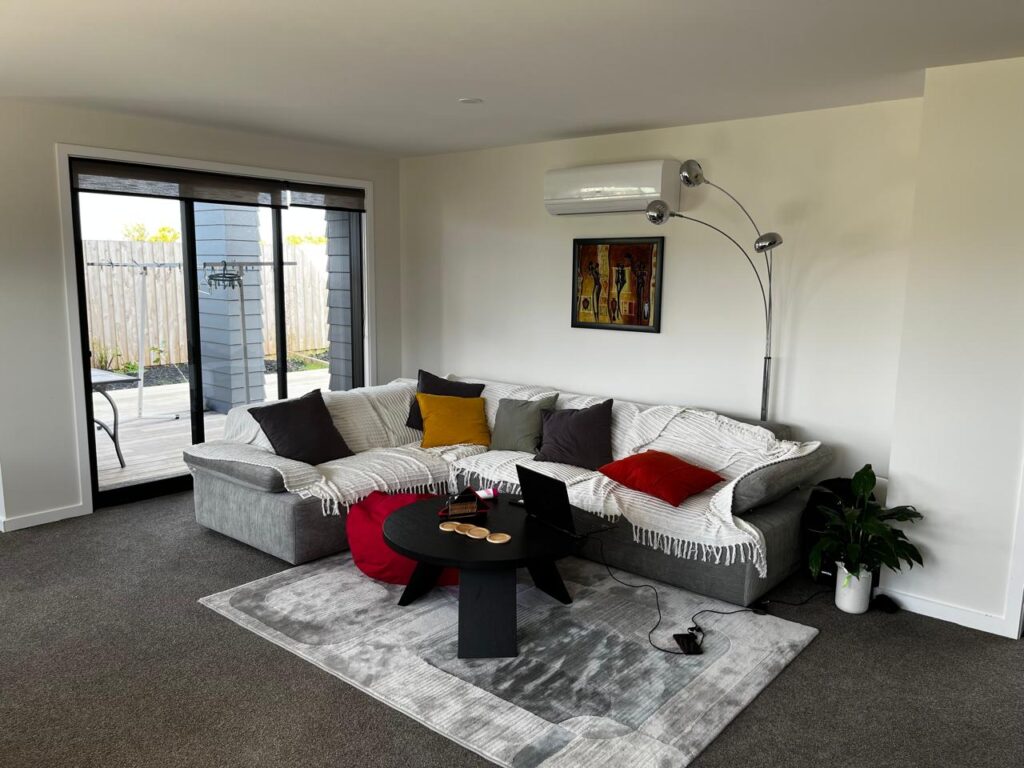
9. Gray: The Cool Neutral
- What It Feels Like: Calm, balanced, and effortlessly chic.
- Where It Works: Living rooms (modern comfort), offices (focused vibes), and minimalist spaces.
- Mood Check: Too much gray can feel dull—add a pop of color to energize the room.
10. Pink: The Gentle Hug
- What It Feels Like: Warm, loving, and nurturing—perfect for cozying up.
- Where It Works: Bedrooms (sweet serenity), kids’ rooms (playful charm), and corners meant for relaxation.
- Watch the Sweetness: Bright pinks can feel too playful—soft blush tones add subtle elegance.
Crafting Your Color Story
Your home is your canvas, and colors are your brushstrokes. Use them wisely to create spaces that feel just right—whether it’s a bold red for passion or a calming blue for serenity.
Pro Tip: Experiment with layers—combine colors, textures, and finishes to craft an environment that speaks to your heart.
Let your space be a reflection of your emotions, and let colors bring your story to life!